Showing posts with label portraits. Show all posts

Monday, March 7, 2016

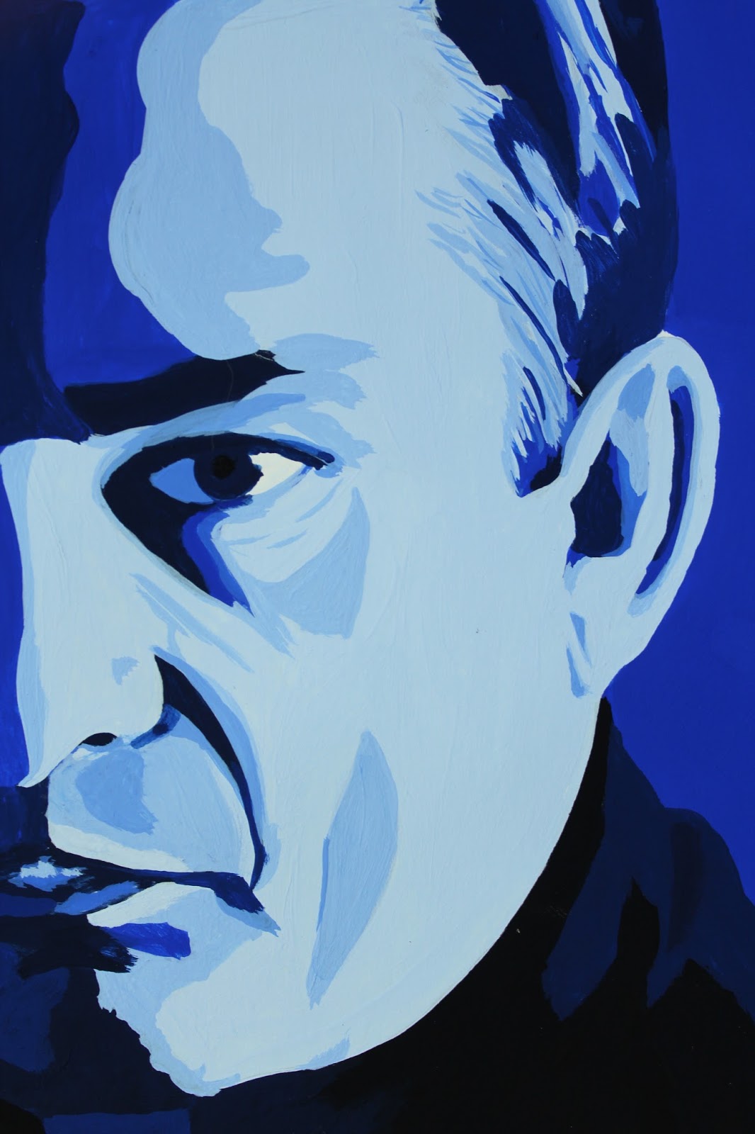
Man in Black: A Monochromatic Study in Gouache


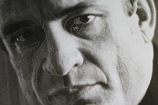
Color Theory. Studying monochromatic color harmony in gouache. Having chosen a portrait of middle aged Johnny Cash, I felt Ultramarine Blue best captured him. Now, for the assignment, I had to print the original image, then use tracing paper to separate the basic shapes made by the different values. Some people just opened the image in Photoshop and hit "posterize." In art school you hear a lot about focusing on the shapes, not the whole image. This certainly helps in the beginning, when a student is breaking down value, tone, shade, and color harmony; learning to recognize them and be able to break them down. Many are also advised this way when they are intimidated by the subject of the assignment, such as a portrait, initially disheartening themselves by believing already that they have no talent for faces. These same students are also often told to work on their piece upside down, so they can look past the face and see the shapes.


The biggest deal with this project is the value scale. On either end you have black and white. Somewhere in the middle lies your chosen color straight out of the tube. I like sticking with an 8x8 inch final painting, so use 16 1/2 inch strips where I steadily mixed white into the blue, then blue to white, until I reached a smooth transition from white to the solid blue. I then approached the black in exactly the same way. I also did a separate scale using just black and white.


From here, I looked for the shapes on my reference photo and assigned them a value by comparing them to my scale.



Approaching my first real painting in gouache, I was unsure where to begin. Accustomed to watercolor, one would start with the lightest value, then work toward the darkest. For oil, it is the opposite. I eventually decided to start with my blue straight from the tube, which turned out to be my median value and, coincidentally, the dominant value as well. It didn't take long to discover this wasn't the best approach, but I had already started, so I just continued on testing darker on top of lighter value and visa versa to see how well they did or didn't layer. It's funny, because I was working on my first vector portrait in my Digital Art class at the same time, and ended up running into the same problem. With the vector piece, however, it wasn't nearly as big a deal to start over and work straight from light to dark. The lighter values simply weren't opaque enough since I was working with more watered down paint. I tested the strictly light to dark approach on my next project with great success. I wasted considerably less paint to boot, since I was just adding color to my initial mix.
The highlights on this were not as clean as I had wanted, since some ended up on top of darker values and I had to layer several times for some and ended up making them larger shapes than they should have been and began to show more brush strokes and look sloppy.


I am still satisfied with the final result as a first piece. This was definitely a learning experience. Bear that in mind when trying this project for yourself. Enjoy the experience, and don't be too hard on yourself. This is merely a familiarity exercise.


After cutting out the painting itself into an 8x8 square, I lined up my value strips and trimmed them to 2" pieces and mounted them neatly on a sheet of 11x14 Bristol board.


MATERIALS

Designer's gouache (any primary or secondary color works best )
Cyan Blue
Ultramarine Blue
Permanent Red
Magenta
Permanent Green (middle)
Permanent Orange
Permanent Yellow
Violet
White
Jet Black
Straight edge ruler (at least 18" with cork backing)
Bristol board 11x14
Tracing paper 11x14
Pencil
Watercolor brushes (varying sizes)
Small spritz bottle (optional, though I find it helps the paint lay more smoothly and give you a bit more work time)
Pallet knife
Pallet (disposable pad works great)

Value scale


Saturday, January 17, 2015

Ugh

Day 17.
I was catching up from yesterday so decided to do two sketched of the same subject. For these I sought to do them both badly, but in different ways. For the first one I used a pen (something in itself I personally never do) and proceeded to start with the mouth of my kitten and work from feature to feature.  The result was disproportionate and askew. 


For the second one I laid out the shape of the face and then filled in the features. I did them both quickly and without really stopping to check accuracy.  The second result was a better shape and accurate features, but only separately.  Put them together and the spacing is off.
With a goal of improving on my ability to quickly lay out a portrait, I wanted to see what does and doesn't work for me.  I mostly use a grid to assure accuracy in my work, but want to be able to sharpen my eye for things so as not to need it and have more confidantly done pieces drawn from life. It pains me to publish these crappy sketches, but it's all a learning process, and I'd rather stay humble than pretend everything comes out perfectly the first time.


I have also been working on a watercolor commission of a full body cat. I was up to the challenge and have so far drawn it 3 times before being satisfied. I am currently at a standstill with the color as I have little extra time and it will take a solid single session to get the main fill. The cat is black, and being just over 5x7, will take just the right brushstrokes to make it work. With four little rescue kittens currently running rampant in the studio, things can be tricky, but at least I am never without inspiration.

Thursday, September 25, 2014

Portfolio

Class is in session, so I had to create another blog.  Ugh.  Anyway, this is for my portfolio, so here it is in all of it's glory!

http://sarahspalsburyportfolio.blogspot.com/

Friday, April 25, 2014

Portraits of Another Style

Okay, so I'm still not totally comfortable looking through the lens, and found this to be especially so in taking portraits.  I LOVE portraits.  That is, to draw and paint them.  Taking photo portraits was a little difficult for me.  I tried to think of how I like a composition set up for a drawing, and that didn't really work.  I like snapshots, and I like closeups; unfortunately, they are hard to get at the same time.
These first photos were taken at Oasis Union Ministry where my Art Therapy class was doing a mandala mural project.


I then took some playful shots of Rudd at work.  I love how this first one came out.


Vito in his truck.  I liked the grittier look, so when I edited I tried to enhance that feel.


Finally, training and resting at the Home Depot.


Good practice for when I one day I have time to do more drawing.  I would definitely like to do more original compositions.  
Next project: Series!  I am excited for this one.  Potentially heading back to the Gardens!


Friday, April 18, 2014

From There to Here

So I just read through all of my previous posts, as I have always done every so often with all of my different blogs, journals, on back to diary entries as a kid.  It has never failed to amuse me how my focus changes over time.  Not very drastically for the most part, but enough to make me sometimes wonder "what was I thinking?!"  I am still bummed that the For Your Service project crashed and burned the way it did.  To explain in completely, I'll start from the beginning.
For a while, I had been running a Free Monthly Portrait contest.  At one point, I got this idea that it should be bigger than it was, and should mean more.  I created a Facebook page, then proceeded to reach out to other military pages to help spread the work.  That first day, US ArmyWTF Moments shared my inquiry and within hours I had over 500 "likes."  I was super stoked, and got to work on a Kickstarter page and set up the details.  People started posting photos and showing support.  Unfortunately, it soon became clear and extremely frustrating that most people don't really read or pay attention to posts.  I didn't want to hurt feelings or come across as negative in any way, but I had specific ideas for what the project encompassed and what I was looking for in subjects.  I n=know I went about it wrong in some aspects, as it took off before I really had it all planned out. I got ahead of myself, then it was at a standstill.
On top of it all, when my next semester started, I had almost no time for anything outside of work and school.  I dropped the project mainly because I didn't know how to revive it properly; and getting people to not only pay attention and participate, but understand what the project even consisted of was beyond frustrating.  It's like being a fan of a book you've never read or a movie you've never seen- people blindly clicked "like," half read posts at best, then promptly forgot any of it ever existed.  If I ever try it again, it will most likely not include any sort of Facebook campaigning.

:(

I know I will continue to stumble onto inspiration and take off on crazy new projects, but at least now I have a better idea what will work out and what will not.  I have gotten much better at turning down commissions that are outside of my skill set (which is unfortunately most of them) but I'd rather do something I do well and enjoy than make promises and turn out something I am disappointed in.  I have always spent so much time on a piece, that even when it came out mediocre, I settled for it.  I am working on my scrap bin, where I am keeping all of my rejects from the world.  Just like Island of Misfit Toys, there may be nothing wrong with them per say, but they are just not quite right.  I think of pieces of mine that I settled for, and I cringe at the thought that it is out there.

I have even created a short tutorial to explain what I accept in a submission.  It makes it easier to reject something if I have specific guidelines.


 It's basic, but gets the main points across.

For now, I am sticking with portraits.  I have really come to love silverpoint, and have done several portraits with it over the last few months.  Taking drawing and watercolor classes have really expanded my range, but I always go back to portraits.

Current work in progress:

Christopher
11x14
silverpoint


Monday, July 15, 2013

For Your Service FAQ

How do I submit photos?
Post photos on the For Your Service Facebook wall.  Please include some history of the subject or the story behind the photo.

How do I invite friends to the page?
Click the “share” link in the drop down menu just underneath the cover photo on the right.

What kind of picture can I post?
Any personal photo of a uniformed U.S. service member, from any branch any time.  Mainly, it cannot be a photo that is copyrighted by anyone other than yourself.  Each subject, or submitter of the winning photo depending on circumstances, will sign a release giving all rights to the painting and any duplicates to the artist.

What is the purpose of this project?
I initiated this project as a way of honoring our American military. Being a member of the USAR, an OEF veteran, and in school working toward my degree in Art Therapy, this project is very dear to me, and I chose this method of sharing personal stories of our veterans through their portraits that many not associated with the military may never see.  For the most part, the news shows either one extreme or the other- the best and worst examples of our men and women in uniform.
This project will highlight the majority, the everyday “Joe” if you will.  Having the main platform on Facebook opens this project up to the largest audience of soldiers and their supporters as well as patrons of the arts. 

Does the winner/subject get the painting?
The subject and/or submitter will get a full-sized duplicate of the painting, but the original will remain with the series as it travels to art shows, fairs, and wherever else pops up as appropriate. 

Will the paintings be for sale?
No.  This is a personal project.  Not just for me, but for those submitting the photos and the subjects of those photos.  Prints, postcards, and other media featuring the portraits will be for sale, and all profits from this project will go right back into funding its continuation.

What is the donated money and profits stemming from this project used for exactly?
This will eventually be a traveling series, heading to art fairs and being submitting to galleries.  On top of entry fees and advertising, prints and other media will need to be purchased in bulk to offer them at a lower price to you. Also, I will be working on a book that chronicles the project, shares other submitted photos and stories, and provides more info on other ways the military and arts community work together.

How are winners chosen?
Each month I will create an album on the Facebook page featuring all submitted photos.  Winner will be chosen by popular vote- the photo with the most “likes” wins.  The best way to increase your photos chances is by tagging yourself and/or subject in it, sharing it, and getting your friends to share and “like” it.

How can I help?

There is a link to Donate on my blog  http://livingartloud.blogspot.com/   Donations of $10 or more will receive 10% off of any commissioned portrait and a postcard featuring any piece you choose from my current gallery.

Main project page is on Facebook:  https://www.facebook.com/ForYourServiceProject

Monday, July 8, 2013

FOR YOUR SERVICE


Since my GeoCities site won't allow me to have a Paypal button, I am going to have it here.  --->
I believe in this project, and insist on keeping it alive.  the For Your Service Facebook page will be where most of the action is, but donations will be directed here.  Any questions or comments, just message me through the Facebook page!