Showing posts with label higher learning. Show all posts

Thursday, March 10, 2016

Finding Your Niche

All the way back to some of my earliest writings in high school, I had this minor obsession with finding my niche, my specific talent or skill that I would be the master of. At first, I thought I would grow up to be this awesome screenwriter, bringing the likes of When Harry Met Sally to theaters on a regular basis. I was also in the Art Club, loved drawing portraits, but believed it when I was told that there was no future for me in art, so I fell away from it for a number of years. 


It's not that I didn't believe I had skill or talent, I just saw being a working artist the same as being a working actor. The business of being a working artist just never appealed to me, and still doesn't. I just like to make art because I enjoy it, and enjoy giving it to people I care about. I have sold some of my artwork, because when the opportunity has presented itself, well, I do still have bills to pay, and it has allowed me to invest in more art supplies. There have also been times when I did make a mild effort to market myself as a working artist. I have always loved portraits,  so decided that must be my elusive niche, I just have to work harder and focus on it. 

Well, that took a lot of the joy of making art out of the art making process.  I get distracted,  and want to try something else. Even now, as a senior in college at the age of 35, I have a (let's call it eclectic) portfolio that I know doesn't really flow well. I was forced to make it a portrait portfolio,  that went through several of the different mediums I have tried. I was told my portfolio should be more consistent,  and that I should beef it up with more works with fewer mediums.  I am still learning,  because I want to learn so many things. That's the consistency of my portfolio.  I was basically being told to force myself into a niche for the sake of my portfolio,  even though my portfolio is supposed to be a representation of myself as an artist. See what I am getting at here?

Well, having learned to let go and accept that I don't have or need to specialize in any one subject or medium, I have freed myself from that feeling of lacking that I carried for so long. I prefer not to try to pigeon hole myself any longer. I am in no way saying that someone who does have a specialty is in any way holding themselves back from trying new things. I just finally understand what kind of artist I am. Having embraced this, I am now thoroughly enjoying challenging myself with each new painting to try something completely new. A few weeks ago I painted an X-Wing, and most recently tried a mountain scene (these project reflections will be posted in the coming weeks.) 

I am currently working on my BFA. My minor is psychology. It took me nearly 10 years as an adult to figure out what I wanted to be when I grew up. I love making art, and sharing it with other people. While I was deployed in 2011 I jokingly referred to my time drawing as art therapy. Turned out Art Therapy is a real thing, and now I am roughly halfway toward my goal of becoming an Art Therapist. My niche was never a specific subject, style, or medium, but a way of making whatever kind of art I want, and use art itself as a medium to help others. 

Monday, March 7, 2016

Man in Black: A Monochromatic Study in Gouache


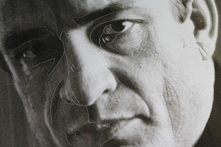
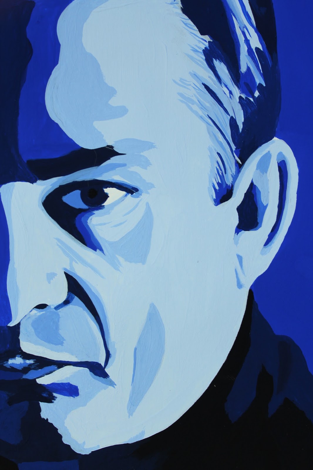
Color Theory. Studying monochromatic color harmony in gouache. Having chosen a portrait of middle aged Johnny Cash, I felt Ultramarine Blue best captured him. Now, for the assignment, I had to print the original image, then use tracing paper to separate the basic shapes made by the different values. Some people just opened the image in Photoshop and hit "posterize." In art school you hear a lot about focusing on the shapes, not the whole image. This certainly helps in the beginning, when a student is breaking down value, tone, shade, and color harmony; learning to recognize them and be able to break them down. Many are also advised this way when they are intimidated by the subject of the assignment, such as a portrait, initially disheartening themselves by believing already that they have no talent for faces. These same students are also often told to work on their piece upside down, so they can look past the face and see the shapes.


The biggest deal with this project is the value scale. On either end you have black and white. Somewhere in the middle lies your chosen color straight out of the tube. I like sticking with an 8x8 inch final painting, so use 16 1/2 inch strips where I steadily mixed white into the blue, then blue to white, until I reached a smooth transition from white to the solid blue. I then approached the black in exactly the same way. I also did a separate scale using just black and white.


From here, I looked for the shapes on my reference photo and assigned them a value by comparing them to my scale.


Approaching my first real painting in gouache, I was unsure where to begin. Accustomed to watercolor, one would start with the lightest value, then work toward the darkest. For oil, it is the opposite. I eventually decided to start with my blue straight from the tube, which turned out to be my median value and, coincidentally, the dominant value as well. It didn't take long to discover this wasn't the best approach, but I had already started, so I just continued on testing darker on top of lighter value and visa versa to see how well they did or didn't layer. It's funny, because I was working on my first vector portrait in my Digital Art class at the same time, and ended up running into the same problem. With the vector piece, however, it wasn't nearly as big a deal to start over and work straight from light to dark. The lighter values simply weren't opaque enough since I was working with more watered down paint. I tested the strictly light to dark approach on my next project with great success. I wasted considerably less paint to boot, since I was just adding color to my initial mix.
The highlights on this were not as clean as I had wanted, since some ended up on top of darker values and I had to layer several times for some and ended up making them larger shapes than they should have been and began to show more brush strokes and look sloppy.


I am still satisfied with the final result as a first piece. This was definitely a learning experience. Bear that in mind when trying this project for yourself. Enjoy the experience, and don't be too hard on yourself. This is merely a familiarity exercise.


After cutting out the painting itself into an 8x8 square, I lined up my value strips and trimmed them to 2" pieces and mounted them neatly on a sheet of 11x14 Bristol board.


MATERIALS

Designer's gouache (any primary or secondary color works best )
Cyan Blue
Ultramarine Blue
Permanent Red
Magenta
Permanent Green (middle)
Permanent Orange
Permanent Yellow
Violet
White
Jet Black
Straight edge ruler (at least 18" with cork backing)
Bristol board 11x14
Tracing paper 11x14
Pencil
Watercolor brushes (varying sizes)
Small spritz bottle (optional, though I find it helps the paint lay more smoothly and give you a bit more work time)
Pallet knife
Pallet (disposable pad works great)

Value scale


Friday, March 4, 2016

A Valuable Study

Gouache seems kind of like an in between of watercolor and acrylic, neither of which I am an expert in, but I have more experience using watercolor. For this project, the journey was our main purpose. We merely had to mix the colors and see what we got.
Our initial step was to create 6 thumbnail sketches of designs. The shapes could be organic or geometric, so long as you ended up with about 50 separate shapes. I laid out 6 4x4 inch squares on a sheet of Bristol board and headed to the library for inspiration. I prefer to leaf through hefty art books to clicking around on Google any day. Of course, the design I chose to work from was actually inspired by the layout of hardwood flooring (I do work at a hardware store, after all.)

I also felt a little Yellow Brick Road vibe here. lol
Step 2 was to then finalize the design on a sheet of tracing paper that we were to use for our painting. I decided on an 8x8 inch final piece, so set up my design just a little bit larger. I have learned through working with Adobe Illustrator that this is referred to as a "bleed," not to be confused with a watercolor bleed.

I felt this final design was a bit more interesting.
I changed up the design by bringing the vanishing point to about 1/3 of the way down and 2/3 of the way to the right. The rule of thirds can apply to any composition, and my portfolio shows my obvious preference for placement in these 1/3, 2/3 sweet spots. We will get more in depth with the Rule of Thirds as we get more into composition.
For this piece, I merely used a ruler to draw lines radiating from my vanishing point, then placed alternating lines between them to create shapes. Be sure to draw lightly so you can completely cover the graphite with the paint. Yellows are very translucent, and you don't want pencil marks showing through. When using gouache, any decent watercolor brush will do. I use a variety of different brands, but mostly stick with my Windsor & Newton size 4 round. The paint I am using is Turner's acrylic gouache, available at Jerry's Artarama. If there is ever anything specific I can't find at Jerry's, I can always find it on Amazon. For this project, we are strictly mixing colors straight from the tube with other colors- no black or white. I have listed all necessary materials below.
This project is strictly for familiarity and experience. Don't worry about the design so much as pay attention to how the colors play together and lay on the paper. This was my first time using gouache as well, so the pictures show my lack of experience with it. It dries much faster than I expected, so I started spritzing my paint on the pallet regularly, though had to learn to lay the paint on thick to keep it opaque.  The nice thing about continuously adding water, however, is that it also virtually eliminates brush marks and leaves the painting nice and smooth. I was worried that gouache would be chalky and awful, but was pleasantly surprised to find it has a nice velvety feel instead. So, paint away. Have fun with this one and get acquainted with this versatile medium!


MATERIALS

Designer's gouache (other colors are optional, but not necessary)
     Cyan Blue
     Ultramarine Blue
     Permanent Red
     Magenta
     Permanent Green (middle)
     Permanent Orange
     Permanent Yellow
     Violet
Straight edge ruler (at least 18" with cork backing)
Bristol board 11x14
Tracing paper 11x14
Pencil
Watercolor brushes (varying sizes)
Small spritz bottle (optional, though I find it helps the paint lay more smoothly and give you a bit more work time)
 Pallet knife
Pallet (disposable pad works great)