Showing posts with label portrait. Show all posts

Monday, March 14, 2016

Analogous Schmagalogous

Third project. Analogous Color Harmony (3 or 4 colors next to each other on the color wheel)
Sooo... this one was off to a rough start. We were told we couldn't do another portrait, and since I had already been working on a colored pencil drawing of a beautiful Maine Coon cat in an analogous color scheme, I figured I would try using the same reference for gouache. 
Bad idea.
I found out the hard way that I have trouble letting go. I struggled to look past the subtle details of the cat's face and simplify it into shapes.


I tried. I really did. I liked the colors for this subject; yellow, yellow green, green, and blue green, but breaking the reference into shapes was just making it look very unappealing to me. Perhaps I just jumped from pure yellow to such a rich yellow green too quickly, and would have gotten better results to capture the pattern of the fur without making it look too splotchy. Either way, this lesson was certainly hard learned, as it happens sometimes. 

Ugh

At this point, I decided it best to move on. Rather than get upset and frustrated when a piece doesn't work out, just carry the lessons from it, and move past it. Don't dwell on or get discouraged when you realize something just isn't working. From here, I figured I might as well just leap as far from my comfort zone as I could get. I have pretty much always done portraits of some sort, so I decided to challenge myself with something completely different.
Being a fan of Star Wars, and surrounded by my girlfriend's Pop! vinyl toys and wall hangings, I couldn't help but be inspired.


It also helps that X-Wings are simply awesome. haha

Don't forget to spritz!!!


So, with my composition laid out, I set out to do a 16 piece value scale that went from solid yellow, to orange, to red.  I tried to be more subtle with my value changes this time, even though I was still using so many colors.


This time, I made sure to start from the brightest value and work my way up the scale steadily.

I kept my value scale right in front of me as I went through layers of color
Working with subtle value changes from layer to layer, I found it was also easier going from light to dark when the layer underneath is already so similar. This allowed me to change values without having to pass the brush over an area more than once, even when working with diluted paint.
Now, one might think that you need black to get the best and boldest contrast. Here, it would have just changed the whole graphic pop vibe completely. This painting was fun to do, and it was good to get out of my element and really try something new.
Same as last time, trimmed final painting to an 8x8 square, then mounted it on Bristol board with my value scale. Now it is your turn. Try a subject you have never done before and run with it!


MATERIALS

Designer's gouache (any combination of analogous colors, 3 or 4 )
     Cyan Blue
     Ultramarine Blue
     Permanent Red
     Magenta
     Permanent Green (middle)
     Permanent Orange
     Permanent Yellow
     Violet
     White
     Jet Black
Straight edge ruler (at least 18" with cork backing)
Bristol board 11x14
Tracing paper 11x14
Pencil
Watercolor brushes (varying sizes)
Small spritz bottle (optional, though I find it helps the paint lay more smoothly and give you a bit more work time)
 Pallet knife
Pallet (disposable pad works great) 
Value scale

Monday, March 7, 2016

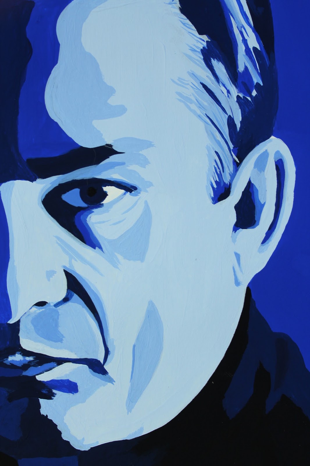
Man in Black: A Monochromatic Study in Gouache


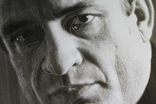
Color Theory. Studying monochromatic color harmony in gouache. Having chosen a portrait of middle aged Johnny Cash, I felt Ultramarine Blue best captured him. Now, for the assignment, I had to print the original image, then use tracing paper to separate the basic shapes made by the different values. Some people just opened the image in Photoshop and hit "posterize." In art school you hear a lot about focusing on the shapes, not the whole image. This certainly helps in the beginning, when a student is breaking down value, tone, shade, and color harmony; learning to recognize them and be able to break them down. Many are also advised this way when they are intimidated by the subject of the assignment, such as a portrait, initially disheartening themselves by believing already that they have no talent for faces. These same students are also often told to work on their piece upside down, so they can look past the face and see the shapes.


The biggest deal with this project is the value scale. On either end you have black and white. Somewhere in the middle lies your chosen color straight out of the tube. I like sticking with an 8x8 inch final painting, so use 16 1/2 inch strips where I steadily mixed white into the blue, then blue to white, until I reached a smooth transition from white to the solid blue. I then approached the black in exactly the same way. I also did a separate scale using just black and white.


From here, I looked for the shapes on my reference photo and assigned them a value by comparing them to my scale.


Approaching my first real painting in gouache, I was unsure where to begin. Accustomed to watercolor, one would start with the lightest value, then work toward the darkest. For oil, it is the opposite. I eventually decided to start with my blue straight from the tube, which turned out to be my median value and, coincidentally, the dominant value as well. It didn't take long to discover this wasn't the best approach, but I had already started, so I just continued on testing darker on top of lighter value and visa versa to see how well they did or didn't layer. It's funny, because I was working on my first vector portrait in my Digital Art class at the same time, and ended up running into the same problem. With the vector piece, however, it wasn't nearly as big a deal to start over and work straight from light to dark. The lighter values simply weren't opaque enough since I was working with more watered down paint. I tested the strictly light to dark approach on my next project with great success. I wasted considerably less paint to boot, since I was just adding color to my initial mix.
The highlights on this were not as clean as I had wanted, since some ended up on top of darker values and I had to layer several times for some and ended up making them larger shapes than they should have been and began to show more brush strokes and look sloppy.


I am still satisfied with the final result as a first piece. This was definitely a learning experience. Bear that in mind when trying this project for yourself. Enjoy the experience, and don't be too hard on yourself. This is merely a familiarity exercise.


After cutting out the painting itself into an 8x8 square, I lined up my value strips and trimmed them to 2" pieces and mounted them neatly on a sheet of 11x14 Bristol board.


MATERIALS

Designer's gouache (any primary or secondary color works best )
Cyan Blue
Ultramarine Blue
Permanent Red
Magenta
Permanent Green (middle)
Permanent Orange
Permanent Yellow
Violet
White
Jet Black
Straight edge ruler (at least 18" with cork backing)
Bristol board 11x14
Tracing paper 11x14
Pencil
Watercolor brushes (varying sizes)
Small spritz bottle (optional, though I find it helps the paint lay more smoothly and give you a bit more work time)
Pallet knife
Pallet (disposable pad works great)

Value scale


Monday, January 11, 2016

Staying Motivated in the New Year. Again.

There always seems to be a large gap between collections of entries.  The past year has been pretty hectic. Running a cat rescue through your home is no joke.  Cute cute cute, and very time consuming. Now we are down to just three adults that have decided to stay, and one lovey Mama who will be going to her forever home at the end of the week.
In other exiting news, Spring semester starts tomorrow, and I am looking forward to two studio classes- Color Theory and Intro to Digital Art. While these are essentially repeats, the classes I took at TCC were credited to electives, and these are a bit more specific. Either way, it will feel good to be back in the studio (and not just because mine is covered in cat fur. lol) I also came across this awesome site for professional readers. This will be especially awesome when DJS becomes more than just a business plan.

Professional Reader

I have also finally broken down and ordered a few varieties of colored pencils, which will be arriving over the next few weeks, and I plan on testing thoroughly and sharing my findings here in detail. I have read so many reviews and watched other people's videos where they have compared products, and maybe it is because I am looking for something so specific, but I just haven't found any to be conclusive for me to invest hundreds of dollars into any one brand. I will probably just pick and choose, then use them all just like I do every new medium I come across anyway.  :/

I have been continuing on a portrait series lately, so will leave you with my latest.


Thursday, October 16, 2014

Portrait- Video Review

   Yeah yeah yeah, so I tend to use my blogs for doing homework.  I usually do so on a different one, but I am going to try to just use this one from now on- mainly because more and more of my papers will be art- related anyway.  I am taking an oil painting class this semester, and have to write a review on a video, any video that's relative.  Well, if any of you are in college, you may be aware of Films On Demand, which is an awesome resource for free educational films.  I went through and, while I found many that looked interesting, watched Portrait- a film documenting UK artist Tai-Shan Schierenberg's portrait of Lord Hartington.  
   The film was only just under 30 minutes, so it flowed smoothly and went through Tai-Shan's entire process, from his initial call to set up the meeting with his sitter, to the presentation of the finished portrait.  Narrated by the artist himself, you feel intimately into his studio. We start out with Tai-Shan leaving his modest apartment and soon arriving at Chatsworth House, a beautiful estate that also holds one of the most extensive private art collections in Britain.  Tai-Shan begins with just two three-hour sessions where he initially paints his subjects head and face only and then photographs the sitter in various poses to use as reference for a full body painting. I was surprised to see that he made no other notes and drew no sketches while with his subject.
   Back in the studio, Tai-Shan spends the next month on the large painting (approximately 4x6'.)  Tai-Shan sits in a chair at the back of his studio, often staring and contemplating the progress of his portrait.  He continuously scrapes the paint away that had portrayed the Duke's face and repainting it.  His brushstrokes tend to be large and sweeping.  His subjects hands are very large, as the artist admits he has a tendency to do, and he leaves them that way. The final portrait is quite serious and rather formal, despite the quick and casual style Tai-Shan has with his brush.  Stoker Cavendish feels in the end that his tie is quite nice, and it is hard to be objective when presented with a larger than life portrait of oneself.
  This video offered a nice peak into the day to day of a portrait artist.  He mentions the fact that about 50% of his portraits are either disliked by the sitter or their spouse, as they most likely had an image of what it should look like already in mind.  Painting royalty has changed greatly since Van Dyck and the days of Henry VIII.  History buff, art student, or anyone looking to catch an interesting glimpse into an artist's thought process should pick up this film.