Showing posts with label art. Show all posts

Monday, March 21, 2016

Ain't No Mountain High Enough

First off, I have no idea how I even came to choose this subject. The only stipulation for this project was to use complimentary colors. Perhaps it was just me fully embracing my adventurous side and going for another completely outside of my comfort zone pieces. Either way, I really loved painting this. I must say, it feels good to try something I have never considered myself even remotely good at, and end up with something so successful. Of course, there were hiccups, and there are some flaws, but as part of my fresh and freer approach to painting, I just let it go, and accept the piece for what it is.

I started out with permanent yellow medium, straight out of the tube, the added dabs of violet to match the values of my reference photo. I wasn't trying to be exact. Remember, we are still working in shapes. No blending. 

For the scale, I went from permanent yellow medium and violet. I worked my way to a solid midpoint the same way as I did with the previous scales. For this one, however, I added white to another few swatches of the midpoint to show a nice beige tones.

As I came to the foreground, I got into using the yellow mixed into violet shades to make sure it all stood out from the mountain. Normally, the darker values cause an object to appear further back, but with atmospheric perspective, it is generally those foggy tones making up the distance. For this sun soaked mountain, the higher key colors represented the light best.

That foreground was proving itself to be a bit difficult. Perhaps I should have worked out the different values on the reference first (like with the Johnny Cash portrait) Either way, I painted over the foreground with it's lightest value (which was still pretty dark) and started again.

Taking longer to rework the foreground on this piece, I ended up bringing it home to the studio.

What made it tricky, was how dark the wet paint was. That splotch in the middle is actually the same color as what is immediately around it.

Finally making the large rocks look like rocks to my satisfaction, I used straight violet for the silhouettes of the climbers. While violet isn't the same value as black, the vibrancy of the figures makes them stand out almost as much as the mountain itself, without competing with it for attention.

Monday, March 7, 2016

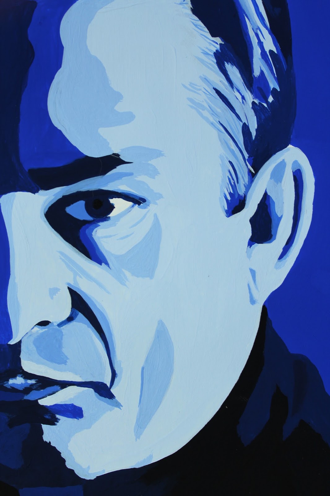
Man in Black: A Monochromatic Study in Gouache


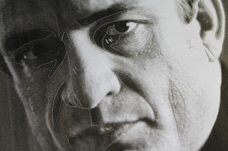
Color Theory. Studying monochromatic color harmony in gouache. Having chosen a portrait of middle aged Johnny Cash, I felt Ultramarine Blue best captured him. Now, for the assignment, I had to print the original image, then use tracing paper to separate the basic shapes made by the different values. Some people just opened the image in Photoshop and hit "posterize." In art school you hear a lot about focusing on the shapes, not the whole image. This certainly helps in the beginning, when a student is breaking down value, tone, shade, and color harmony; learning to recognize them and be able to break them down. Many are also advised this way when they are intimidated by the subject of the assignment, such as a portrait, initially disheartening themselves by believing already that they have no talent for faces. These same students are also often told to work on their piece upside down, so they can look past the face and see the shapes.
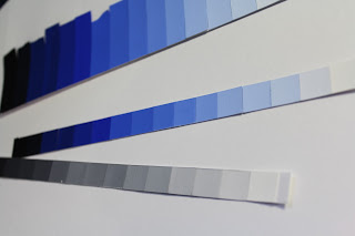


The biggest deal with this project is the value scale. On either end you have black and white. Somewhere in the middle lies your chosen color straight out of the tube. I like sticking with an 8x8 inch final painting, so use 16 1/2 inch strips where I steadily mixed white into the blue, then blue to white, until I reached a smooth transition from white to the solid blue. I then approached the black in exactly the same way. I also did a separate scale using just black and white.


From here, I looked for the shapes on my reference photo and assigned them a value by comparing them to my scale.



Approaching my first real painting in gouache, I was unsure where to begin. Accustomed to watercolor, one would start with the lightest value, then work toward the darkest. For oil, it is the opposite. I eventually decided to start with my blue straight from the tube, which turned out to be my median value and, coincidentally, the dominant value as well. It didn't take long to discover this wasn't the best approach, but I had already started, so I just continued on testing darker on top of lighter value and visa versa to see how well they did or didn't layer. It's funny, because I was working on my first vector portrait in my Digital Art class at the same time, and ended up running into the same problem. With the vector piece, however, it wasn't nearly as big a deal to start over and work straight from light to dark. The lighter values simply weren't opaque enough since I was working with more watered down paint. I tested the strictly light to dark approach on my next project with great success. I wasted considerably less paint to boot, since I was just adding color to my initial mix.
The highlights on this were not as clean as I had wanted, since some ended up on top of darker values and I had to layer several times for some and ended up making them larger shapes than they should have been and began to show more brush strokes and look sloppy.


I am still satisfied with the final result as a first piece. This was definitely a learning experience. Bear that in mind when trying this project for yourself. Enjoy the experience, and don't be too hard on yourself. This is merely a familiarity exercise.


After cutting out the painting itself into an 8x8 square, I lined up my value strips and trimmed them to 2" pieces and mounted them neatly on a sheet of 11x14 Bristol board.


MATERIALS

Designer's gouache (any primary or secondary color works best )
Cyan Blue
Ultramarine Blue
Permanent Red
Magenta
Permanent Green (middle)
Permanent Orange
Permanent Yellow
Violet
White
Jet Black
Straight edge ruler (at least 18" with cork backing)
Bristol board 11x14
Tracing paper 11x14
Pencil
Watercolor brushes (varying sizes)
Small spritz bottle (optional, though I find it helps the paint lay more smoothly and give you a bit more work time)
Pallet knife
Pallet (disposable pad works great)

Value scale


Friday, March 4, 2016

A Valuable Study

Gouache seems kind of like an in between of watercolor and acrylic, neither of which I am an expert in, but I have more experience using watercolor. For this project, the journey was our main purpose. We merely had to mix the colors and see what we got.
Our initial step was to create 6 thumbnail sketches of designs. The shapes could be organic or geometric, so long as you ended up with about 50 separate shapes. I laid out 6 4x4 inch squares on a sheet of Bristol board and headed to the library for inspiration. I prefer to leaf through hefty art books to clicking around on Google any day. Of course, the design I chose to work from was actually inspired by the layout of hardwood flooring (I do work at a hardware store, after all.)

I also felt a little Yellow Brick Road vibe here. lol
Step 2 was to then finalize the design on a sheet of tracing paper that we were to use for our painting. I decided on an 8x8 inch final piece, so set up my design just a little bit larger. I have learned through working with Adobe Illustrator that this is referred to as a "bleed," not to be confused with a watercolor bleed.

I felt this final design was a bit more interesting.
I changed up the design by bringing the vanishing point to about 1/3 of the way down and 2/3 of the way to the right. The rule of thirds can apply to any composition, and my portfolio shows my obvious preference for placement in these 1/3, 2/3 sweet spots. We will get more in depth with the Rule of Thirds as we get more into composition.
For this piece, I merely used a ruler to draw lines radiating from my vanishing point, then placed alternating lines between them to create shapes. Be sure to draw lightly so you can completely cover the graphite with the paint. Yellows are very translucent, and you don't want pencil marks showing through. When using gouache, any decent watercolor brush will do. I use a variety of different brands, but mostly stick with my Windsor & Newton size 4 round. The paint I am using is Turner's acrylic gouache, available at Jerry's Artarama. If there is ever anything specific I can't find at Jerry's, I can always find it on Amazon. For this project, we are strictly mixing colors straight from the tube with other colors- no black or white. I have listed all necessary materials below.
This project is strictly for familiarity and experience. Don't worry about the design so much as pay attention to how the colors play together and lay on the paper. This was my first time using gouache as well, so the pictures show my lack of experience with it. It dries much faster than I expected, so I started spritzing my paint on the pallet regularly, though had to learn to lay the paint on thick to keep it opaque.  The nice thing about continuously adding water, however, is that it also virtually eliminates brush marks and leaves the painting nice and smooth. I was worried that gouache would be chalky and awful, but was pleasantly surprised to find it has a nice velvety feel instead. So, paint away. Have fun with this one and get acquainted with this versatile medium!


MATERIALS

Designer's gouache (other colors are optional, but not necessary)
     Cyan Blue
     Ultramarine Blue
     Permanent Red
     Magenta
     Permanent Green (middle)
     Permanent Orange
     Permanent Yellow
     Violet
Straight edge ruler (at least 18" with cork backing)
Bristol board 11x14
Tracing paper 11x14
Pencil
Watercolor brushes (varying sizes)
Small spritz bottle (optional, though I find it helps the paint lay more smoothly and give you a bit more work time)
 Pallet knife
Pallet (disposable pad works great) 

Monday, January 11, 2016

Staying Motivated in the New Year. Again.

There always seems to be a large gap between collections of entries.  The past year has been pretty hectic. Running a cat rescue through your home is no joke.  Cute cute cute, and very time consuming. Now we are down to just three adults that have decided to stay, and one lovey Mama who will be going to her forever home at the end of the week.
In other exiting news, Spring semester starts tomorrow, and I am looking forward to two studio classes- Color Theory and Intro to Digital Art. While these are essentially repeats, the classes I took at TCC were credited to electives, and these are a bit more specific. Either way, it will feel good to be back in the studio (and not just because mine is covered in cat fur. lol) I also came across this awesome site for professional readers. This will be especially awesome when DJS becomes more than just a business plan.

Professional Reader

I have also finally broken down and ordered a few varieties of colored pencils, which will be arriving over the next few weeks, and I plan on testing thoroughly and sharing my findings here in detail. I have read so many reviews and watched other people's videos where they have compared products, and maybe it is because I am looking for something so specific, but I just haven't found any to be conclusive for me to invest hundreds of dollars into any one brand. I will probably just pick and choose, then use them all just like I do every new medium I come across anyway.  :/

I have been continuing on a portrait series lately, so will leave you with my latest.


Tuesday, January 6, 2015

Sherlocked

Day 4
I have recently been catching up on Sherlock.  Being winter break with my regular shows and taking off a semester of school, I actually have a bit of time to finally check out some of the shows I have been missing.  So, having been thoroughly Sherlocked for the day, I of course had to do today's sketch of Benedict Cumberbatch.  Having never been one for sketching and laying down a quick and solid foundation of a drawing, I ran out of time before I had much more than his eyes in place. Too much drawing, not enough sketching.  My problem has always been focusing too much on the details from the jump, instead of the whole shape.  This is one of the main areas I am trying to fix by doing this project.  I figure a few months down the line I will revisit this reference and see if I have made the improvements I am hoping for.


Day 5
Spent all day at work, was so tired, and it was 11pm. No sketch yet.  I initially thought of vintage toys, like my oil painting from last semester.  Well, I ended up looking through images of vintage trucks.  There is a photographer I discovered through Deviant Art years ago who is awesome, so I thought I would try something different.  Of course, last night I couldn't think of his name, so settled for what I could find. Eh, maybe I need to make my time limit 15 minutes instead of 10? I have only been using a basic B drawing pencil for my sketches so far since I just carry the book around to work and stuff.  I'm thinking tonight I might add a splash of color. :)


Wednesday, December 31, 2014

Sketch A Day 2015

It has been long established that I am bad at keeping a Sketchbook. I have been since high school. For this past semester oil painting class I had to keep a book updated with regular assignments. Honestly, I did half of them the day before I turned it in.
So, why I am I setting a goal to complete a sketch every day for the next 365 days?  I see the benefit of sketching, and now that I am taking a semester off and won't necessarily 'have' to sketch regularly (Yes, the "having to" part makes a big difference for me) I am taking it upon myself to learn and grow by doing unplanned daily sketches that I will not let be the detailed portraits that often take up so much time and frustration because I am a perfectionist. 
My main goal with this project is to learn to let go (stop thinking of Frozen, that was so 2014)  When i do any sort of drawing or art project, i know ahead of time that have at least several hours of work ahead of me. I often envy the quick and confidant strokes of many artists. I get caught up in the details, and while it all comes together in the end, I would like to broaden my scope by practicing quicker techniques and different subjects.
For this project I will also have to accept the fact that much of What I share will be crap, but I will share it anyway because no one is perfect and I am setting a time limit of 10 minutes each to keep myself from overlooking like I am prone to doing. Be prepared for lots of cats, faces, and hopefully a few non-boring sketches over the next 365 days. I'm starting off with Koopa wishing everyone a Happy New Year. She wouldn't stay still, so I had to take a picture for reference  :/ 

Monday, October 13, 2014

A Few Updates

Okay, so I am not very adept at utilizing social media, and am slow to get the ball rolling here as well, but this semester I am finally taking my Portfolio and Resume class, so I need to get my butt in gear!  I have added a separate page here dedicated to my trimmed down and properly flowing portfolio.  The pieces chosen are the most recent and relevant, placed in an order that makes sense- there is actually a narrative that I could include, and perhaps one day I will, but for now I will let it speak for itself.
Also, I am excited about a new group I am part of on Facebook- Sarah's Street Gang. This is not mine, but Sarah Pekkanen's Street Team group.  Way back when I first started this blog I was also working on getting books for the 302nd Bookworms I sent an email to Sarah requesting some copies of The Opposite of Me.  She was awesome, keeping me posted about getting some from her publisher.  With crazy shipping restriction, we couldn't get the books, but she did send us  All Is Bright- her just released short story.  As part of her "Street Gang," I get to virtually hang out with other awesome fans and continue to share her books.
I am such a book nerd, and still hope to one day have the time to do some paintings inspired by some of my favorite books.  So many projects, so little time!  Well, I am learning a bit about oil painting at the moment, so expect to see another twist in my paintings as I find a way to integrate it!  Since I have been working on my Tyrion in Different Media series, looks like I have to throw another one in there.  I will leave you with it's current progress.  So far, Watercolor/ Mixed Media, and about half way through silverpoint.


Friday, April 18, 2014

From There to Here

So I just read through all of my previous posts, as I have always done every so often with all of my different blogs, journals, on back to diary entries as a kid.  It has never failed to amuse me how my focus changes over time.  Not very drastically for the most part, but enough to make me sometimes wonder "what was I thinking?!"  I am still bummed that the For Your Service project crashed and burned the way it did.  To explain in completely, I'll start from the beginning.
For a while, I had been running a Free Monthly Portrait contest.  At one point, I got this idea that it should be bigger than it was, and should mean more.  I created a Facebook page, then proceeded to reach out to other military pages to help spread the work.  That first day, US ArmyWTF Moments shared my inquiry and within hours I had over 500 "likes."  I was super stoked, and got to work on a Kickstarter page and set up the details.  People started posting photos and showing support.  Unfortunately, it soon became clear and extremely frustrating that most people don't really read or pay attention to posts.  I didn't want to hurt feelings or come across as negative in any way, but I had specific ideas for what the project encompassed and what I was looking for in subjects.  I n=know I went about it wrong in some aspects, as it took off before I really had it all planned out. I got ahead of myself, then it was at a standstill.
On top of it all, when my next semester started, I had almost no time for anything outside of work and school.  I dropped the project mainly because I didn't know how to revive it properly; and getting people to not only pay attention and participate, but understand what the project even consisted of was beyond frustrating.  It's like being a fan of a book you've never read or a movie you've never seen- people blindly clicked "like," half read posts at best, then promptly forgot any of it ever existed.  If I ever try it again, it will most likely not include any sort of Facebook campaigning.

:(

I know I will continue to stumble onto inspiration and take off on crazy new projects, but at least now I have a better idea what will work out and what will not.  I have gotten much better at turning down commissions that are outside of my skill set (which is unfortunately most of them) but I'd rather do something I do well and enjoy than make promises and turn out something I am disappointed in.  I have always spent so much time on a piece, that even when it came out mediocre, I settled for it.  I am working on my scrap bin, where I am keeping all of my rejects from the world.  Just like Island of Misfit Toys, there may be nothing wrong with them per say, but they are just not quite right.  I think of pieces of mine that I settled for, and I cringe at the thought that it is out there.

I have even created a short tutorial to explain what I accept in a submission.  It makes it easier to reject something if I have specific guidelines.


 It's basic, but gets the main points across.

For now, I am sticking with portraits.  I have really come to love silverpoint, and have done several portraits with it over the last few months.  Taking drawing and watercolor classes have really expanded my range, but I always go back to portraits.

Current work in progress:

Christopher
11x14
silverpoint


Monday, July 8, 2013

FOR YOUR SERVICE


Since my GeoCities site won't allow me to have a Paypal button, I am going to have it here.  --->
I believe in this project, and insist on keeping it alive.  the For Your Service Facebook page will be where most of the action is, but donations will be directed here.  Any questions or comments, just message me through the Facebook page!