Friday, July 1, 2016

The Value of Value


For this project, our goal was to learn more about value and saturation (which I will refer to as intensity.) Using some sort of tribal mask or a very strong geometric design, we set out to do two renditions.  One using a triadic color harmony (3 colors equally spaced on the colorwheel) and the second using one of those colors gradually mixed with a gray of equal value.
I used a photo editing app on my phone to verify my values were equal by desaturating a photo of both my yellow-orange and gray and comparing the two. I made sure I had plenty mixed of each so I wouldn't run out while painting my scale and mask design. 
Now, normally, I start with the lightest value and work my way to the darkest, but since my entire palette was the same value, things were a bit tricky. This is where I decided to look at the colors in terms of intensity when determining where to put what colors. The more intense colors (or true to the original yellow-orange mixture) stood out to the eye more, so I put it on focal points, like the lips, and the midrange colors seemed to recede more, so I put those around the eyes and other such places to still give the design that carved quality.  While I would have liked to blend in shadows and add depth, this class did not allow it. It is what it is. Sometimes by limiting yourself, however, you still gain a better understanding of the basics you are working with.


Modern technology is awesome, and I used a photo editing app on my phone to mirror and convert the original to grayscale to check my values.
As usual, the drawings were laid out on bristol board.

While the value wasn't truly consistent, the project still worked. The higher contrast of the top piece made for a much more appealing and dynamic painting.

Monday, March 21, 2016

Ain't No Mountain High Enough

First off, I have no idea how I even came to choose this subject. The only stipulation for this project was to use complimentary colors. Perhaps it was just me fully embracing my adventurous side and going for another completely outside of my comfort zone pieces. Either way, I really loved painting this. I must say, it feels good to try something I have never considered myself even remotely good at, and end up with something so successful. Of course, there were hiccups, and there are some flaws, but as part of my fresh and freer approach to painting, I just let it go, and accept the piece for what it is.

I started out with permanent yellow medium, straight out of the tube, the added dabs of violet to match the values of my reference photo. I wasn't trying to be exact. Remember, we are still working in shapes. No blending. 

For the scale, I went from permanent yellow medium and violet. I worked my way to a solid midpoint the same way as I did with the previous scales. For this one, however, I added white to another few swatches of the midpoint to show a nice beige tones.

As I came to the foreground, I got into using the yellow mixed into violet shades to make sure it all stood out from the mountain. Normally, the darker values cause an object to appear further back, but with atmospheric perspective, it is generally those foggy tones making up the distance. For this sun soaked mountain, the higher key colors represented the light best.

That foreground was proving itself to be a bit difficult. Perhaps I should have worked out the different values on the reference first (like with the Johnny Cash portrait) Either way, I painted over the foreground with it's lightest value (which was still pretty dark) and started again.

Taking longer to rework the foreground on this piece, I ended up bringing it home to the studio.

What made it tricky, was how dark the wet paint was. That splotch in the middle is actually the same color as what is immediately around it.

Finally making the large rocks look like rocks to my satisfaction, I used straight violet for the silhouettes of the climbers. While violet isn't the same value as black, the vibrancy of the figures makes them stand out almost as much as the mountain itself, without competing with it for attention.

Monday, March 14, 2016

Analogous Schmagalogous

Third project. Analogous Color Harmony (3 or 4 colors next to each other on the color wheel)
Sooo... this one was off to a rough start. We were told we couldn't do another portrait, and since I had already been working on a colored pencil drawing of a beautiful Maine Coon cat in an analogous color scheme, I figured I would try using the same reference for gouache. 
Bad idea.
I found out the hard way that I have trouble letting go. I struggled to look past the subtle details of the cat's face and simplify it into shapes.


I tried. I really did. I liked the colors for this subject; yellow, yellow green, green, and blue green, but breaking the reference into shapes was just making it look very unappealing to me. Perhaps I just jumped from pure yellow to such a rich yellow green too quickly, and would have gotten better results to capture the pattern of the fur without making it look too splotchy. Either way, this lesson was certainly hard learned, as it happens sometimes. 

Ugh

At this point, I decided it best to move on. Rather than get upset and frustrated when a piece doesn't work out, just carry the lessons from it, and move past it. Don't dwell on or get discouraged when you realize something just isn't working. From here, I figured I might as well just leap as far from my comfort zone as I could get. I have pretty much always done portraits of some sort, so I decided to challenge myself with something completely different.
Being a fan of Star Wars, and surrounded by my girlfriend's Pop! vinyl toys and wall hangings, I couldn't help but be inspired.


It also helps that X-Wings are simply awesome. haha

Don't forget to spritz!!!


So, with my composition laid out, I set out to do a 16 piece value scale that went from solid yellow, to orange, to red.  I tried to be more subtle with my value changes this time, even though I was still using so many colors.


This time, I made sure to start from the brightest value and work my way up the scale steadily.

I kept my value scale right in front of me as I went through layers of color
Working with subtle value changes from layer to layer, I found it was also easier going from light to dark when the layer underneath is already so similar. This allowed me to change values without having to pass the brush over an area more than once, even when working with diluted paint.
Now, one might think that you need black to get the best and boldest contrast. Here, it would have just changed the whole graphic pop vibe completely. This painting was fun to do, and it was good to get out of my element and really try something new.
Same as last time, trimmed final painting to an 8x8 square, then mounted it on Bristol board with my value scale. Now it is your turn. Try a subject you have never done before and run with it!


MATERIALS

Designer's gouache (any combination of analogous colors, 3 or 4 )
     Cyan Blue
     Ultramarine Blue
     Permanent Red
     Magenta
     Permanent Green (middle)
     Permanent Orange
     Permanent Yellow
     Violet
     White
     Jet Black
Straight edge ruler (at least 18" with cork backing)
Bristol board 11x14
Tracing paper 11x14
Pencil
Watercolor brushes (varying sizes)
Small spritz bottle (optional, though I find it helps the paint lay more smoothly and give you a bit more work time)
 Pallet knife
Pallet (disposable pad works great) 
Value scale

Thursday, March 10, 2016

Finding Your Niche

All the way back to some of my earliest writings in high school, I had this minor obsession with finding my niche, my specific talent or skill that I would be the master of. At first, I thought I would grow up to be this awesome screenwriter, bringing the likes of When Harry Met Sally to theaters on a regular basis. I was also in the Art Club, loved drawing portraits, but believed it when I was told that there was no future for me in art, so I fell away from it for a number of years. 


It's not that I didn't believe I had skill or talent, I just saw being a working artist the same as being a working actor. The business of being a working artist just never appealed to me, and still doesn't. I just like to make art because I enjoy it, and enjoy giving it to people I care about. I have sold some of my artwork, because when the opportunity has presented itself, well, I do still have bills to pay, and it has allowed me to invest in more art supplies. There have also been times when I did make a mild effort to market myself as a working artist. I have always loved portraits,  so decided that must be my elusive niche, I just have to work harder and focus on it. 

Well, that took a lot of the joy of making art out of the art making process.  I get distracted,  and want to try something else. Even now, as a senior in college at the age of 35, I have a (let's call it eclectic) portfolio that I know doesn't really flow well. I was forced to make it a portrait portfolio,  that went through several of the different mediums I have tried. I was told my portfolio should be more consistent,  and that I should beef it up with more works with fewer mediums.  I am still learning,  because I want to learn so many things. That's the consistency of my portfolio.  I was basically being told to force myself into a niche for the sake of my portfolio,  even though my portfolio is supposed to be a representation of myself as an artist. See what I am getting at here?

Well, having learned to let go and accept that I don't have or need to specialize in any one subject or medium, I have freed myself from that feeling of lacking that I carried for so long. I prefer not to try to pigeon hole myself any longer. I am in no way saying that someone who does have a specialty is in any way holding themselves back from trying new things. I just finally understand what kind of artist I am. Having embraced this, I am now thoroughly enjoying challenging myself with each new painting to try something completely new. A few weeks ago I painted an X-Wing, and most recently tried a mountain scene (these project reflections will be posted in the coming weeks.) 

I am currently working on my BFA. My minor is psychology. It took me nearly 10 years as an adult to figure out what I wanted to be when I grew up. I love making art, and sharing it with other people. While I was deployed in 2011 I jokingly referred to my time drawing as art therapy. Turned out Art Therapy is a real thing, and now I am roughly halfway toward my goal of becoming an Art Therapist. My niche was never a specific subject, style, or medium, but a way of making whatever kind of art I want, and use art itself as a medium to help others. 

Monday, March 7, 2016

Man in Black: A Monochromatic Study in Gouache


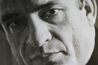
Color Theory. Studying monochromatic color harmony in gouache. Having chosen a portrait of middle aged Johnny Cash, I felt Ultramarine Blue best captured him. Now, for the assignment, I had to print the original image, then use tracing paper to separate the basic shapes made by the different values. Some people just opened the image in Photoshop and hit "posterize." In art school you hear a lot about focusing on the shapes, not the whole image. This certainly helps in the beginning, when a student is breaking down value, tone, shade, and color harmony; learning to recognize them and be able to break them down. Many are also advised this way when they are intimidated by the subject of the assignment, such as a portrait, initially disheartening themselves by believing already that they have no talent for faces. These same students are also often told to work on their piece upside down, so they can look past the face and see the shapes.


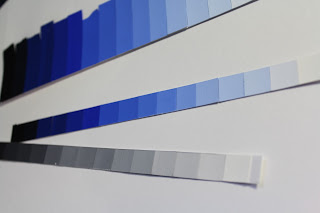
The biggest deal with this project is the value scale. On either end you have black and white. Somewhere in the middle lies your chosen color straight out of the tube. I like sticking with an 8x8 inch final painting, so use 16 1/2 inch strips where I steadily mixed white into the blue, then blue to white, until I reached a smooth transition from white to the solid blue. I then approached the black in exactly the same way. I also did a separate scale using just black and white.


From here, I looked for the shapes on my reference photo and assigned them a value by comparing them to my scale.


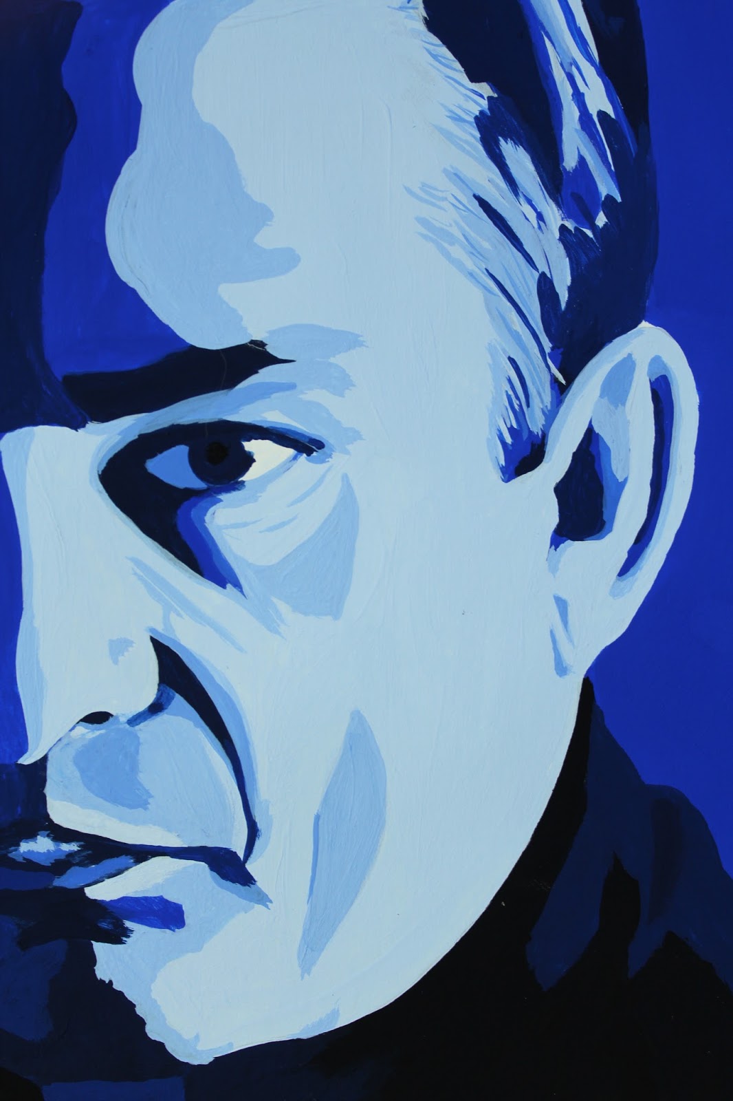
Approaching my first real painting in gouache, I was unsure where to begin. Accustomed to watercolor, one would start with the lightest value, then work toward the darkest. For oil, it is the opposite. I eventually decided to start with my blue straight from the tube, which turned out to be my median value and, coincidentally, the dominant value as well. It didn't take long to discover this wasn't the best approach, but I had already started, so I just continued on testing darker on top of lighter value and visa versa to see how well they did or didn't layer. It's funny, because I was working on my first vector portrait in my Digital Art class at the same time, and ended up running into the same problem. With the vector piece, however, it wasn't nearly as big a deal to start over and work straight from light to dark. The lighter values simply weren't opaque enough since I was working with more watered down paint. I tested the strictly light to dark approach on my next project with great success. I wasted considerably less paint to boot, since I was just adding color to my initial mix.
The highlights on this were not as clean as I had wanted, since some ended up on top of darker values and I had to layer several times for some and ended up making them larger shapes than they should have been and began to show more brush strokes and look sloppy.


I am still satisfied with the final result as a first piece. This was definitely a learning experience. Bear that in mind when trying this project for yourself. Enjoy the experience, and don't be too hard on yourself. This is merely a familiarity exercise.


After cutting out the painting itself into an 8x8 square, I lined up my value strips and trimmed them to 2" pieces and mounted them neatly on a sheet of 11x14 Bristol board.


MATERIALS

Designer's gouache (any primary or secondary color works best )
Cyan Blue
Ultramarine Blue
Permanent Red
Magenta
Permanent Green (middle)
Permanent Orange
Permanent Yellow
Violet
White
Jet Black
Straight edge ruler (at least 18" with cork backing)
Bristol board 11x14
Tracing paper 11x14
Pencil
Watercolor brushes (varying sizes)
Small spritz bottle (optional, though I find it helps the paint lay more smoothly and give you a bit more work time)
Pallet knife
Pallet (disposable pad works great)

Value scale


Friday, March 4, 2016

A Valuable Study

Gouache seems kind of like an in between of watercolor and acrylic, neither of which I am an expert in, but I have more experience using watercolor. For this project, the journey was our main purpose. We merely had to mix the colors and see what we got.
Our initial step was to create 6 thumbnail sketches of designs. The shapes could be organic or geometric, so long as you ended up with about 50 separate shapes. I laid out 6 4x4 inch squares on a sheet of Bristol board and headed to the library for inspiration. I prefer to leaf through hefty art books to clicking around on Google any day. Of course, the design I chose to work from was actually inspired by the layout of hardwood flooring (I do work at a hardware store, after all.)

I also felt a little Yellow Brick Road vibe here. lol
Step 2 was to then finalize the design on a sheet of tracing paper that we were to use for our painting. I decided on an 8x8 inch final piece, so set up my design just a little bit larger. I have learned through working with Adobe Illustrator that this is referred to as a "bleed," not to be confused with a watercolor bleed.

I felt this final design was a bit more interesting.
I changed up the design by bringing the vanishing point to about 1/3 of the way down and 2/3 of the way to the right. The rule of thirds can apply to any composition, and my portfolio shows my obvious preference for placement in these 1/3, 2/3 sweet spots. We will get more in depth with the Rule of Thirds as we get more into composition.
For this piece, I merely used a ruler to draw lines radiating from my vanishing point, then placed alternating lines between them to create shapes. Be sure to draw lightly so you can completely cover the graphite with the paint. Yellows are very translucent, and you don't want pencil marks showing through. When using gouache, any decent watercolor brush will do. I use a variety of different brands, but mostly stick with my Windsor & Newton size 4 round. The paint I am using is Turner's acrylic gouache, available at Jerry's Artarama. If there is ever anything specific I can't find at Jerry's, I can always find it on Amazon. For this project, we are strictly mixing colors straight from the tube with other colors- no black or white. I have listed all necessary materials below.
This project is strictly for familiarity and experience. Don't worry about the design so much as pay attention to how the colors play together and lay on the paper. This was my first time using gouache as well, so the pictures show my lack of experience with it. It dries much faster than I expected, so I started spritzing my paint on the pallet regularly, though had to learn to lay the paint on thick to keep it opaque.  The nice thing about continuously adding water, however, is that it also virtually eliminates brush marks and leaves the painting nice and smooth. I was worried that gouache would be chalky and awful, but was pleasantly surprised to find it has a nice velvety feel instead. So, paint away. Have fun with this one and get acquainted with this versatile medium!


MATERIALS

Designer's gouache (other colors are optional, but not necessary)
     Cyan Blue
     Ultramarine Blue
     Permanent Red
     Magenta
     Permanent Green (middle)
     Permanent Orange
     Permanent Yellow
     Violet
Straight edge ruler (at least 18" with cork backing)
Bristol board 11x14
Tracing paper 11x14
Pencil
Watercolor brushes (varying sizes)
Small spritz bottle (optional, though I find it helps the paint lay more smoothly and give you a bit more work time)
 Pallet knife
Pallet (disposable pad works great) 

Thursday, February 18, 2016

Out With the Old

Impromptu overhaul of the studio has put a pause on any actual work getting done in there for the moment.


Yeah, it was mostly for the cats. Haha.

 Plenty of painting at school, however. No matter how fundamental,  every art class can teach any artist. This semester I am taking another, more comprehensive,  color class where I am using gouache for the first time.
Now, I have this aversion to flat, chalky paint, so you can imagine my initial feelings towards it. Full time job, cat rescue, and full class schedule make it difficult to do any extracurricular experiments,  but I will try to carve out some time over the next week as I work on my class project (monochromatic portrait of Johnny Cash) to test out some ideas.
So far all I have done with, it is a couple of value scales. I will be posting detailed tutorials here soon of each of my projects. I have also started up a page on Patreon that I will often link back to my blog on as well. I am currently backtracking a bit to start my entries chronologically from the first project.  I wouldn't call these tutorials so much as just a documentation of my learning experience. These will serve as a reflection on my process and the project as a whole, and I am offering these reflections to anyone else looking to try their hand at any of these sorts of projects that I will be working on throughout my academic career and beyond.

Monday, January 11, 2016

Staying Motivated in the New Year. Again.

There always seems to be a large gap between collections of entries.  The past year has been pretty hectic. Running a cat rescue through your home is no joke.  Cute cute cute, and very time consuming. Now we are down to just three adults that have decided to stay, and one lovey Mama who will be going to her forever home at the end of the week.
In other exiting news, Spring semester starts tomorrow, and I am looking forward to two studio classes- Color Theory and Intro to Digital Art. While these are essentially repeats, the classes I took at TCC were credited to electives, and these are a bit more specific. Either way, it will feel good to be back in the studio (and not just because mine is covered in cat fur. lol) I also came across this awesome site for professional readers. This will be especially awesome when DJS becomes more than just a business plan.

Professional Reader

I have also finally broken down and ordered a few varieties of colored pencils, which will be arriving over the next few weeks, and I plan on testing thoroughly and sharing my findings here in detail. I have read so many reviews and watched other people's videos where they have compared products, and maybe it is because I am looking for something so specific, but I just haven't found any to be conclusive for me to invest hundreds of dollars into any one brand. I will probably just pick and choose, then use them all just like I do every new medium I come across anyway.  :/

I have been continuing on a portrait series lately, so will leave you with my latest.


Saturday, January 17, 2015

Ugh

Day 17.
I was catching up from yesterday so decided to do two sketched of the same subject. For these I sought to do them both badly, but in different ways. For the first one I used a pen (something in itself I personally never do) and proceeded to start with the mouth of my kitten and work from feature to feature.  The result was disproportionate and askew. 


For the second one I laid out the shape of the face and then filled in the features. I did them both quickly and without really stopping to check accuracy.  The second result was a better shape and accurate features, but only separately.  Put them together and the spacing is off.
With a goal of improving on my ability to quickly lay out a portrait, I wanted to see what does and doesn't work for me.  I mostly use a grid to assure accuracy in my work, but want to be able to sharpen my eye for things so as not to need it and have more confidantly done pieces drawn from life. It pains me to publish these crappy sketches, but it's all a learning process, and I'd rather stay humble than pretend everything comes out perfectly the first time.


I have also been working on a watercolor commission of a full body cat. I was up to the challenge and have so far drawn it 3 times before being satisfied. I am currently at a standstill with the color as I have little extra time and it will take a solid single session to get the main fill. The cat is black, and being just over 5x7, will take just the right brushstrokes to make it work. With four little rescue kittens currently running rampant in the studio, things can be tricky, but at least I am never without inspiration.

Tuesday, January 6, 2015

Sherlocked

Day 4
I have recently been catching up on Sherlock.  Being winter break with my regular shows and taking off a semester of school, I actually have a bit of time to finally check out some of the shows I have been missing.  So, having been thoroughly Sherlocked for the day, I of course had to do today's sketch of Benedict Cumberbatch.  Having never been one for sketching and laying down a quick and solid foundation of a drawing, I ran out of time before I had much more than his eyes in place. Too much drawing, not enough sketching.  My problem has always been focusing too much on the details from the jump, instead of the whole shape.  This is one of the main areas I am trying to fix by doing this project.  I figure a few months down the line I will revisit this reference and see if I have made the improvements I am hoping for.


Day 5
Spent all day at work, was so tired, and it was 11pm. No sketch yet.  I initially thought of vintage toys, like my oil painting from last semester.  Well, I ended up looking through images of vintage trucks.  There is a photographer I discovered through Deviant Art years ago who is awesome, so I thought I would try something different.  Of course, last night I couldn't think of his name, so settled for what I could find. Eh, maybe I need to make my time limit 15 minutes instead of 10? I have only been using a basic B drawing pencil for my sketches so far since I just carry the book around to work and stuff.  I'm thinking tonight I might add a splash of color. :)


Saturday, January 3, 2015

There Is No Owl

I didn't really know what to expect from myself when I set my Sketch A Day goal.  I guess I assumed the same thing would happen that always does when I think about having to sketch something- I dread it. As it turns out, I spent my time in the bath this evening finally reading the copy of The Once and Future King that I had purchased no less than 8 years ago and my mind wandered to what I might sketch tonight. One of the rules i had set was "No planning," but I don't think this really counted since I was already counting on knocking out today's page right after my bath.
I found I was looking forward to tonight's page, thinking about how much I loved the Disney version of King Arthur and used to play the vhs tapes at night and pause them to sit and draw it out on a large sheet of drawing paper on the coffee table (I should dig this out of my box in the attic just for nostalgia).  Being eager to do any sketching is definitely not something I expected.  I know it's only day 3, but I am starting to believe I may actually get to enjoy this project.  It's definitely nice not having to worry about homework and deadlines for a change and just throw down whatever image interests me. Today it was Archemedes, Merlyn's owl.


I pulled T.H. White's book down from the attic the other day when I was going through some boxes.  I also happened across a small journal my best friend had sent me for my 30th birthday.  It would seem it all had perfect timing, so now I am also using the journal for my sketches since it is nice and small.  The paper is also handmade and toothy, so I like it much better than the bristol board I was using earlier.  I don't know how people can draw on such a smooth surface. It was horrible for just doing quick sketches.
Another day down. I am looking forward to where tomorrow will take me.

Wednesday, December 31, 2014

Sketch A Day 2015

It has been long established that I am bad at keeping a Sketchbook. I have been since high school. For this past semester oil painting class I had to keep a book updated with regular assignments. Honestly, I did half of them the day before I turned it in.
So, why I am I setting a goal to complete a sketch every day for the next 365 days?  I see the benefit of sketching, and now that I am taking a semester off and won't necessarily 'have' to sketch regularly (Yes, the "having to" part makes a big difference for me) I am taking it upon myself to learn and grow by doing unplanned daily sketches that I will not let be the detailed portraits that often take up so much time and frustration because I am a perfectionist. 
My main goal with this project is to learn to let go (stop thinking of Frozen, that was so 2014)  When i do any sort of drawing or art project, i know ahead of time that have at least several hours of work ahead of me. I often envy the quick and confidant strokes of many artists. I get caught up in the details, and while it all comes together in the end, I would like to broaden my scope by practicing quicker techniques and different subjects.
For this project I will also have to accept the fact that much of What I share will be crap, but I will share it anyway because no one is perfect and I am setting a time limit of 10 minutes each to keep myself from overlooking like I am prone to doing. Be prepared for lots of cats, faces, and hopefully a few non-boring sketches over the next 365 days. I'm starting off with Koopa wishing everyone a Happy New Year. She wouldn't stay still, so I had to take a picture for reference  :/ 

Thursday, October 16, 2014

Portrait- Video Review

   Yeah yeah yeah, so I tend to use my blogs for doing homework.  I usually do so on a different one, but I am going to try to just use this one from now on- mainly because more and more of my papers will be art- related anyway.  I am taking an oil painting class this semester, and have to write a review on a video, any video that's relative.  Well, if any of you are in college, you may be aware of Films On Demand, which is an awesome resource for free educational films.  I went through and, while I found many that looked interesting, watched Portrait- a film documenting UK artist Tai-Shan Schierenberg's portrait of Lord Hartington.  
   The film was only just under 30 minutes, so it flowed smoothly and went through Tai-Shan's entire process, from his initial call to set up the meeting with his sitter, to the presentation of the finished portrait.  Narrated by the artist himself, you feel intimately into his studio. We start out with Tai-Shan leaving his modest apartment and soon arriving at Chatsworth House, a beautiful estate that also holds one of the most extensive private art collections in Britain.  Tai-Shan begins with just two three-hour sessions where he initially paints his subjects head and face only and then photographs the sitter in various poses to use as reference for a full body painting. I was surprised to see that he made no other notes and drew no sketches while with his subject.
   Back in the studio, Tai-Shan spends the next month on the large painting (approximately 4x6'.)  Tai-Shan sits in a chair at the back of his studio, often staring and contemplating the progress of his portrait.  He continuously scrapes the paint away that had portrayed the Duke's face and repainting it.  His brushstrokes tend to be large and sweeping.  His subjects hands are very large, as the artist admits he has a tendency to do, and he leaves them that way. The final portrait is quite serious and rather formal, despite the quick and casual style Tai-Shan has with his brush.  Stoker Cavendish feels in the end that his tie is quite nice, and it is hard to be objective when presented with a larger than life portrait of oneself.
  This video offered a nice peak into the day to day of a portrait artist.  He mentions the fact that about 50% of his portraits are either disliked by the sitter or their spouse, as they most likely had an image of what it should look like already in mind.  Painting royalty has changed greatly since Van Dyck and the days of Henry VIII.  History buff, art student, or anyone looking to catch an interesting glimpse into an artist's thought process should pick up this film.